
- Web Development
- June 17, 2021
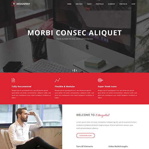
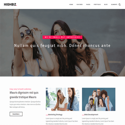
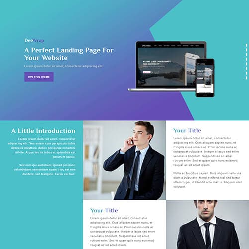
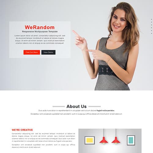
GridWhizz is a multipurpose responsive template designed to fit for any category like fashion, business, hotel, professinals, clothes, sports, portfolio, photography, food, blog, art & culture, medical, landing pages, wedding, real estate websites. You can switch between multiple layout as it is designed with different styles of image screen, slider screen, gradient overlay, video background, navigation with left, right, and full overlay. Pages for about us, services, pricing plan, image gallery with 2, 3 and 4 column display, conatct with map, and 404 error are included in the template.
You can showcase your work, products or services with light box, boxed with 2 & 3 column, and single product display. Blogs and latest updates can also be displayed creatively with the help of left and right sidebar, grid or masonry blogs with 2 or 3 column, single blog with left & right sidebar including tags and category filters whihc is designed in the template. Website customization will easy to change according to requirements with the help of web elements like icons, typography, buttons, alerts & wells, tabs & accordions, form fields, etc designed with the template. It is entirely built in Bootstrap framework, HTML5, CSS3 and JQuery. This template is 100% responsive cross browser template, compatible on all devices, displayed on all screen sizes. View demo!
Published: | March 21, 2018 |
Categories: | |
Tags: |
Please note that the images in the template will be blurred in the downloaded package.
Facing issues with this template? Write to support@themevault.net and we'll help you out.
Join our mailing list to receive the latest news and updates from our team.